While its efforts were appreciated, after being quickly presented to leadership this super simple "show me dont tell me" aproach did not end up being recieved - as it was seen as not having enough "voice". So far the brand had invested in a very straight forward aproach. Maintaining an honest "voice" with the customer is held above all else, as it should. The idea to be "authentic" and forth comming about how we execute this communication in our messaging is very dialog heavy, with perhpas that same rich in depth explanation our website had taken for so many successful years. I must also confess the idea of showing a proof of concept at some what of a mid fydelity can be a confusing format. As it can get too close to looking like a poorly executed un polished finished spot. In my opinion its possible this also may have suffered form such, an "uncanny valley" of devices issue.
Device Beauty Shots - ad prototype "animatic" or "rip"
To celebrate our newly designed hardware, in anticipation of its release I created this PROOF OF CONCEPT ( renders, animation, device content on screen is not final).
Advertising, Animation, Computer Animation
You may also like
2017 3D/Motion Reel
2015
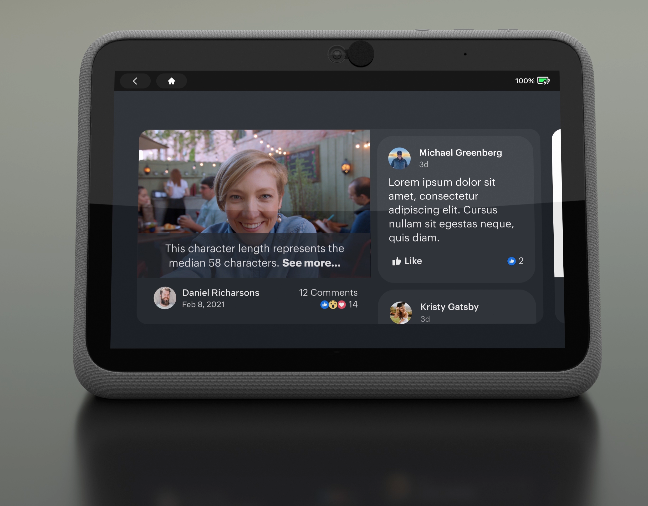
Product Design
2022

UX mobile design motion/interaction.
2015
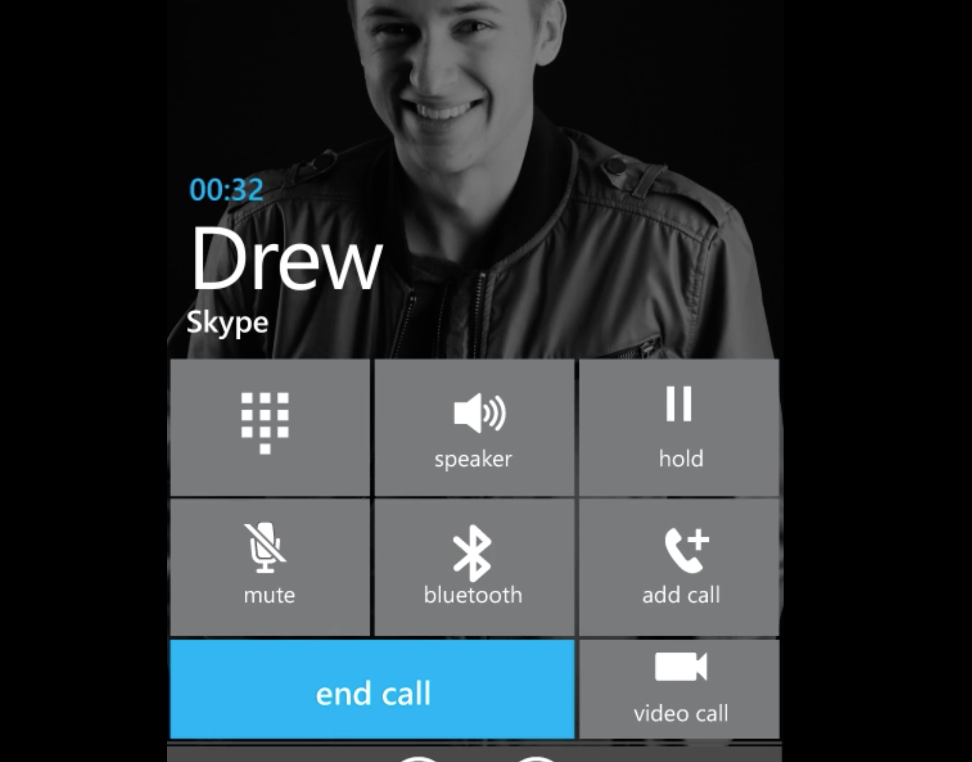
Skype call integration to Windows Phone
2017
Vampire Diaries Promo (won Emmy award)
2011
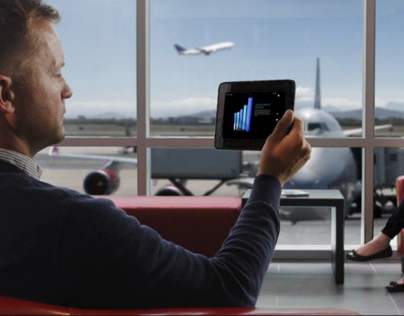
KindleFire HD positioning video
2014

CW11 RE_BRAND
2015
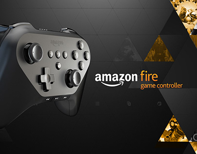
Amazon FireTV Game Controller detail page video.
2014
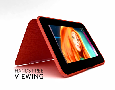
Kindle - accessory detail page video ( leather cover)
2014

Amazon Kindle - product detail page video.
2014
