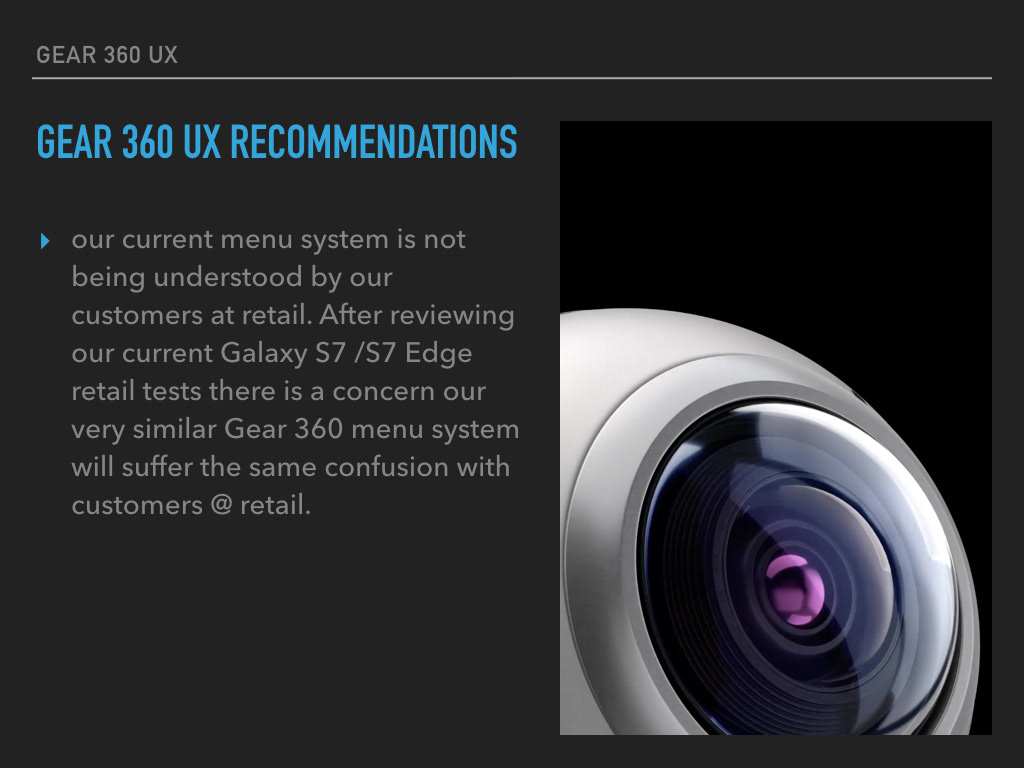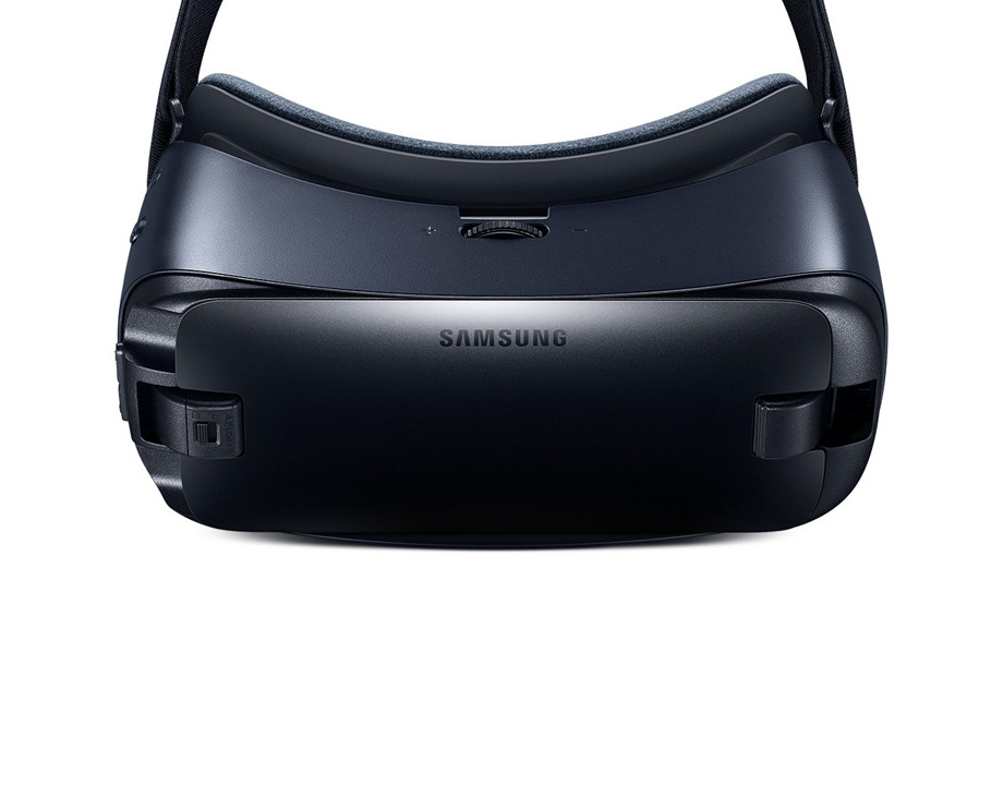
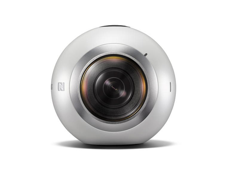
Samsung Gear 360 video camera.
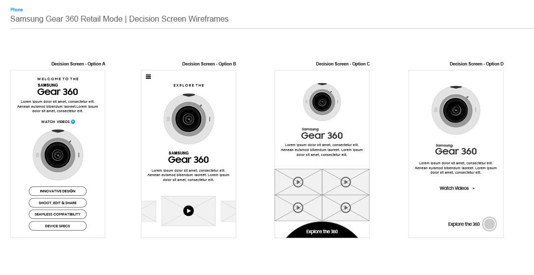

As an ambitious user research campaign we conducted studies both at carrier locations across the US, as well as remote user research via one of our partners "User Zoom". I had the privilege to travel to multiple test sites across the US and was able to observe first hand the discrepancies within our mobile app design. Our initial findings were very conclusive, it was apparent there were some pretty devastating disconnects in our basic over all UX design. Customers @ retail were not interpreting our applications how we had designed them. They were basically falling out completely, exiting the experience just after the first interaction. When intercepted, most all UX study participants mentioned they were hungry for more information but didn't think there was much more to explore. When in fact they were abandoning about 90% of our application, most importantly the device feature demo's and very resource heavy live action "vignettes". At a quick first glance an overwhelming amount of our retail app users were seeing our main menu as a "dead end". It simply was not registering to them as a main menu system that could lead them to much deeper, much richer content. Again, at a quick glance, our visual design was falling short of being quickly recognizable. Customers saw it as "then end credits", nothing more to see here... " the fine print" as one participant mentioned.
Since we were trying to build better consistency across our family of product applications, these same problems were cascading across our other devices. The Gear 360 was one of the projects I was leading at the time which I believed to be immediately effected. While this was not by any means a fully-featured user research analysis, this was a first attempt at sharing some of the more glaring UX concerns and more importantly, some quick ideas on how we could easily modify our UX to see if we could avoid some of the unintentional diversion that was happening. Below is a quick motion study suggesting some quick fix ideas and a brief overview/ explanation in order to provide some context to the products business owners. This short deck / motion study was something I was able to quickly suggest while we were in a Chicago UX testing lab. I built this in the evening one night from my hotel room in hopes that we could take advantage of our lab facility/schedule and see what type of effect some simple motion UX could provide...