Camera UI interaction and Motion Design for Windows Phone.
I was asked to work with our visual designers and lead interaction designer for the camera UX on this project. The goal was to use motion graphic techniques and prototype a variety of possible user interactions that would provide a quick solid camera utility, with immediate feedback of the shutter. Building a clean, straight forward intuitive experience was number one, speed, performance and "delight" was second. This specific design exploration was the one that was chosen by our creative director. I then worked with program engineers to implement into the actual software build of the device. This feature as showed shipped in the final build as the official camera experience for Windows Phone
Using my 5 month old as subject :) I played around with modifying different instances of visual feedback the camera UI could provide.
One of the biggest variables we needed to consider was dealing with limitations of the hardware's "lag time", as this was always being covered by our UI animations. A strong design trait WP7 had from launch, that others did not.
What became very clear in our usability studies was that "perservered" speed and the overall fluidity of the user experience solely rested on how well we could provide visual feedback that something was happening immediately after the feature was engaged by the user.
In some cases our hardware (depending on the feature) was even milliseconds behind some of the competing products, however when tested in our lab enviroment it was very conclusive our device was "much faster", which we quickly attributed to the type of interaction model driven by diliberate motion design. Wait time durations varied from feature to feature, but as a result of our well thought out motion language we established, the experience was considered to be not just consistant but considerably faster than the other options at the time.
In addition the the "hunt to focus", shoot (shutter release and capture) and "save to album" affirmation UX for Windows Phone, I also had the privilege of designing the video player's visual feedback for capture, idle, stop and resume video capture on device feature. This was shipped as the native OS video functionality before Nokia's camera app utility came on the Windows Phone scene.
I should also call out that this was in collaberation with Windows Phone Creative Director, Interactive Designer, lead Motion Design and Developer contributions. I worked along with these very talented collegues to achieve this successful group effort.
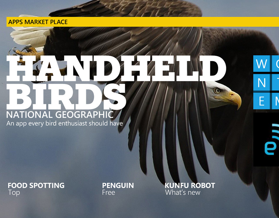
As the unofficial "photographer" of the design team I was asked from time to time to be the "photo guy". This afforded me some fun opportunities, over the course I was working in the WP7 design studio I got to contribute the main photography used towards multiple design books that were printied. Looking back, knowing that our "Metro" design had such an impact on the entire company publications like this which no doubt had made their rounds in Redmond and contributed to evagalizing our design principals we always stood by. This became very clear as a Windows lead company was all of a sudden asking us for our design comps, which quickly became the official company wide uniform design language known today as " Modern".
